Bobby Fernandes

PhotoTalk 2020/08

2020-08.cdr

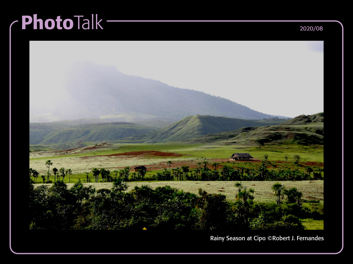
I started off this series of chats with photos from two local photographers (Kester Clarke and Kwesi Isles), because I think that it is important to recognise and highlight our local talent, while also learning from the established and legendary photographers from around the globe. Today I want to share an image by one of our own local legends, Mr. Robert J. Fernandes, better known as Bobby Fernandes.

Although not my favourite image from him, I think that this image exemplifies some of the things that has always made Uncle Bobby’s images meaningful to me. This one is called “Rainy Season at Cipo”.

What follows are my own views, I can’t speak for anyone else; I grew up seeing his works on calendars, whether it was nature or architecture I was always fascinated, I think I learned more about local buildings, and about our country from seeing his photos on calendars than I did from the papers, mainly because I would ask questions of my parents or grand-parents about the images I was seeing. His images of anywhere outside of Georgetown were captivating to me, and he became known for these, I believe mainly because he had something most others didn’t, and that was access to these places, but I remember my parents and grand-parents saying to me that Bobby had “the eye”. He saw things and captured them on film in a way other people here didn’t.

As I myself got to know Uncle Bobby in later years, as I myself was beginning to learn about photography, I was surprised to learn that when I spoke about shutter speeds and aperture, ISO and bracketing, and all the other camera techniques I was learning about, he’d be amused in a way, because to him those were “camera tricks” and not very important to the final image, he was all about what he was seeing, yes, he’d use the camera and its settings, but the visual impact was more important; and there it was, it dawned on me that my parents and grand-parents were right, he had “the eye”.

I remember one conversation with some other photographers one Friday evening where we were discussing his work, and the lack of technical excellence in Bobby’s work came up, and at the end the general consensus was that Bobby wasn’t a gear-head like some of us are these days, he was a photographer, and the results speak for themselves.

He lived in the Orinduik area for many years, and his images of vistas, water-falls and life there will always remain with me, as will his other works of wildlife, natural patterns, and much more. If you can get your hands on his last book “99 Best” you would not be disappointed.

Michael C. Lam


Our eighth post in the PhotoTalk series, this was posted to the Guyana Photographers’ Facebook Group on the 7th April, 2020. The original comments and discussion can be seen on that post.

Ghandi – Margaret Bourke-White

PhotoTalk 2020/06

2020-06.cdr

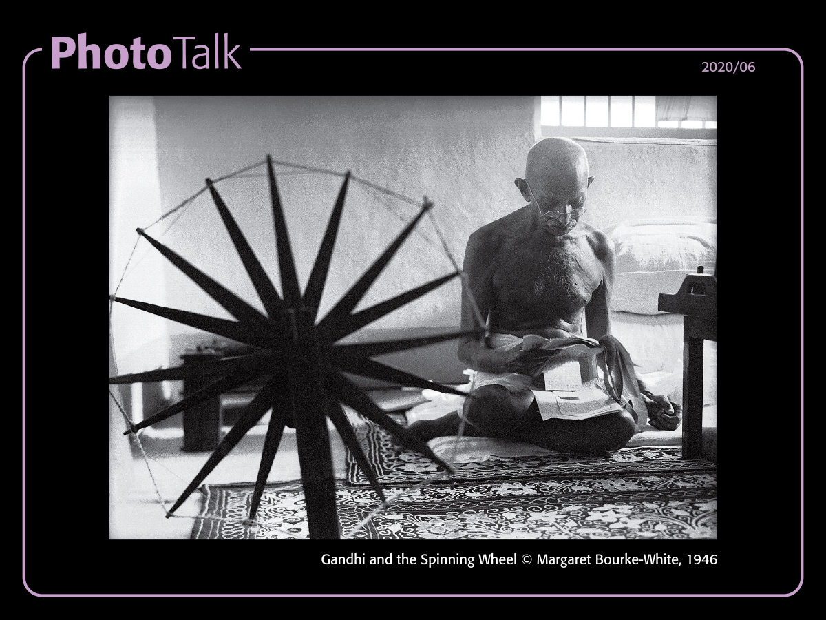
Let’s talk about a famous female photographer, but not necessarily about her famous photo.

Margaret Bourke-White is known for her famous photograph of Ghandi and the Spinning Wheel; it is a notable photo for several reasons, among which are the fact that its a photo of Mahatma Ghandi, she was the last person to do his portraits before his assassination (and interview him, a story in itself), it captured Ghandi as never before, the simple man at his then infamous charkha, she was the first woman to break into the photojournalism field, her photo was the cover of the very first TIME magazine, and the list of her accomplishments goes on.

The amazing thing to me is that she became famous for doing something she originally didn’t want to do, photograph people, especially those in politics. She started out shooting waterfalls to make ends meet, then into a bit of architecture, until she got to shoot subjects she was passionate about, machinery, things in industrial America (and the wider world), then into photojournalism, the war, etc.

I could go on, but you should check our her story yourselves, as well as photos from those earlier periods.

So let’s talk, got opinions? got questions, let’s chat!


Original post to the Guyana Photographers’ Facebook group was done on April 3rd, 2020. Original comments and discussion can be seen on that post.

Ansel Adams – Michael C. Lam

PhotoTalk 2020/03

2020-03.cdr

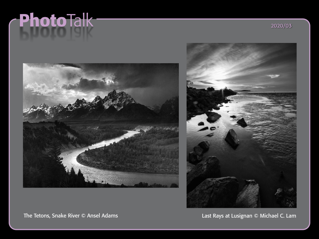
One of my inspirations has always been Ansel Adams, his black and white landscapes have always fascinated me. Ansel shot film back then and did his own dark room work, concentrating on his “Zone System” to get the details he needed. You should read more about that. While “The Tetons, Snake River” isn’t my favourite Ansel Adams photograph it illustrates my description of what he accomplished, and some of what I’ve aspired to. Feel free to discuss the good / bad of his work, whether you think his work was great or over-hyped, etc. 

When I started this PhotoTalk series, Dione had asked me how I get my black and white images to be “Black and White”, she says all of hers a tinge to them, red/yellow/orange… I do most of my processing in Adobe Lightroom, my base processing involves getting the highlights and shadows where I want them, and also making sure that there is the sharpness I need. I do tend to go for high contrast black and whites more than softer low-contrast images. I’ve juxtaposed one of mine here with that of Ansel’s for comparison and contrast. When I get the image where I need it in lightroom, I either use the LR Black and white tab to ensure that its in BW or I do further processing in DXO Nik Silver Efex.

Calling them Black and White is actually incorrect, they are monochrome images, lots of shades or grey. When I am printing, I ensure that I use black and white/monochrome files and that the printer uses as close to only Black ink as possible instead of mixing inks (CMYK) – for display, all files are RGB, but I try to ensure that in LR my settings are usually in Black and White. Images that have warmer tones like red/yellow/orange or even cooler tones towards blue may usually need a simple white balance adjustment towards a neutral temperature setting.

My process is not secret, and I am always open to questions.   Ansel’s Zone System is well documented and you should give it a read and learn a little from it.


Original published on the Guyana Photographers’ Facebook Page on March 30th, 2020. Original comments and discussions can be seen on the original post.


PhotoTalk – Wildlife; Kester Clarke and Kwesi Isles

First in the PhotoTalk series.

PhotoTalk 2020/01

Untitled-2

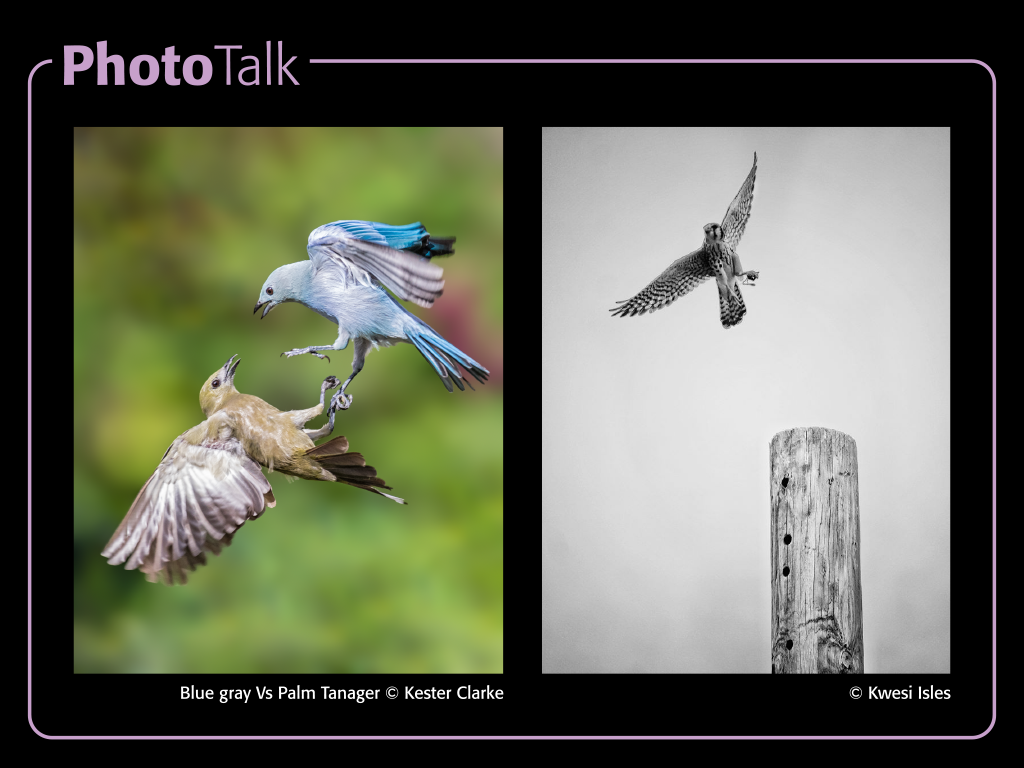
I’ve always admired those folks who do wildlife photography, in Guyana its mostly Bird Photography, but they do get in quite a bit of wildlife too. For local art competitions and exhibitions its been hard for these photos to break into the top where they are considered art.

My view on this has always been that the photographers approach has a lot to do with it. Many Bird Photographers are concentrating on catching the Bird, whether at rest or in flight, its not an easy task to get a great shot of the bird; what results most times are what I consider Bird Portraits, again, excellent work, but often not considered “art” by many.

I was discussing this with an artist and one of the things I came away from that conversation with was that the resulting photographs often lacked other compositional elements related to “story-telling”.

I wanted to mention two “Bird” photographs that, in my opinion, broke through that barrier and by themselves speak volumes. Kester Clarke’s image gives not only action in a still frame, but also offers drama, the shallow depth of field, the sharp details in the birds with the bit of motion blur on the wings makes it an instant pleaser. Kwesi Isles’ image uses subtle background detail with sharp foreground detail in the “post” to add to the main subject in flight, putting it in greyscale lets the viewer see all of this while being undistracted by colour, I haven’t seen the coloured version, but I believe that the background colour would have diminished the clarity seen in the black and white version.

Just my two cents. 

Thanks Kester and Kwesi!

Michael C. Lam


Originally published on the Guyana Photographers’ Facebook page on March 25th, 2020. Comments can be seen there on the post.


Today is Tomorrow’s Yesterday

As Guyana heads into inevitable elections and a possible and uncertain future where Oil may play a large role (larger than necessary), some photographers, including Nikhil Ramkarran, Dwayne Hackett and Darrell Carpenay, have been saying both privately and publicly that Georgetown (and the coastal areas) will undergo certain changes; they see it as a time to capture life as we see it before that change is in our past.


“Photographers deal in things which are continually vanishing and when they have vanished there is no contrivance on earth which can make them come back again.” – Henri Cartier-Bresson

Clean-Up – 19-0102 | DXO One
Continue reading

Image and Identity

Present 04

The Moray House Trust recently started a series of events targeted at small groups of individuals with common interests. They call it The Third Place, a space to nurture conversation, community and an exchange of ideas. The format includes a short talk by someone knowledgeable in a particular field, followed by a chance to discuss it further over dinner. Dinner is made using local produce, prepared specially for the evening.

On Tuesday March 6th, 2018, I was one of the dinner guests (don’t let the term “guest” fool you, you do pay for dinner) at one titled “Image and Identity”, where the guest of honour and speaker was my good friend Nikhil Ramkarran, a lawyer by profession but an artist at heart. In total, there were 9 dinner guests in attendance, and our backgrounds and professions were considerably diverse.

Continue reading

GVACE 2017 – Making the cut

2017 - post - making the cut


If the judging goes as per normal (and by normal, I mean, what generally happens in competitions of this sort), here’s a few thoughts on what to expect.

Since the re-invigoration of the Visual Arts competition after too long a hiatus, a few categories were added, including Photography; because of the relative ease of access to photographic capture devices, it was no surprise that the number of entries was large as compared to other traditional Visual Art categories like painting, drawing and sculpture.

In 2012, 52 entries were recorded and in 2014, 86 entries were recorded (as far as I can ascertain from media records available).

To begin with, all qualifying entries are viewed collectively and a pre-judging session is expected to take place, weeding out what may be obvious non-contenders, those that just don’t impress the judges in any way.  After that, the remaining images, most times, between 75-95% of the original entries are then scrutinised and judged individually by each judge in the panel.  It has been known for the process to proceed with the field narrowing in groups, until a Finalist shortlist is reached, from this shortlist, the final winners of the Gold, Silver and Bronze medals are selected.

For me, there are three basic stages of making the cut…  To make it past the pre-judging phase usually means your work is good enough to reach the Exhibition phase, this in itself is an accomplishment, you get to be on Exhibition with your peers as well as being able to put into your list of accomplishments, being part of an Exhibition at the National Art Gallery, Castellani House.  The second stage of making the cut is to be Shortlisted, here you are considered a finalist; the last cut is, of course, being the recipient of one of those medals (and the accompanying cash prize).

Below, you can see a display of the shortlisted and medal winning photos from 2012 and 2014.

Shortlisters

Don’t try to find a pattern, there isn’t really one.  The judges change, and the dynamics change from event to event, the one commonality that I can easily point out in these images is their strong compositions.

In 2014 I had mentioned a few times that it was likely that the top three would be different, and it happened, I think it is a distinct possibility that we can see another set of names up there in the top three again this time around.

Choose your images wisely, forget what you “think” the judges may want to see, find one (or three) that you are passionate about, and use it.


13508856_10209814166049767_8850099048653375459_n

Michael C. Lam works in Graphic layout for a living, one of his images gained the Bronze medal in the 2012 GVACE, he was shortlisted for the 2014 GVACE, was an exhibiting artist in the Un | Fixed Homeland curated exhibition at Aljira, New Jersey in 2016, and an exhibiting artist at the 2016 VISIONS Curated Exhibition. Some of his work can be seen on his site The Michael Lam Collection


GVACE 2017 – Presentation

2017 - post - presentation


Let’s talk about the final look of your piece(s).

After printing and signing your photograph, it has to be prepared for presentation.  Its important to remember that this is a Visual Arts Competition AND Exhibition, your photograph is being entered as an art piece, and the presentation of the piece is important, not only for the judging by the official judges, but by those viewing it at exhibition, for those of us who may be lucky enough to make it to exhibition.

As photographers, we probably have more options than most other aspects of the Visual Arts in terms of our final presentation; the basic thing is that whatever you submit must be ready to hang on a wall, there should be nothing left for the curator to do.

Whether you want it matted and framed behind glass, or framed without the matte, or even without the glass; or if you want it mounted on foam board, frameless with a mounting hook at the back; or sandwiched between two sheets of glass with polished studs in the corners; or mounted on a piece of plywood; it is an artistic decision in itself.

Whatever you decide, it should complement the photo and not detract from it; or you can choose one to be so innocuous that no one notices it.

For example, it is unlikely that a black and white portrait would look good in a red frame, so don’t do it; a fancy frame may work with an abstract image, but may or may not look garish on a landscape; and you probably wouldn’t want a four inch thick frame around a very small photo… these are not rules, you have to decide what may work best. Look around, see what frames or mounting options may appeal to your piece, ask opinions.

When all is said and done, you are presenting a finished piece to be judged and displayed, make it worthy of your name.

Let’s make this GVACE one to remember.


13508856_10209814166049767_8850099048653375459_n

Michael C. Lam works in Graphic layout for a living, one of his images gained the Bronze medal in the 2012 GVACE, he was shortlisted for the 2014 GVACE, was an exhibiting artist in the Un | Fixed Homeland curated exhibition at Aljira, New Jersey in 2016, and an exhibiting artist at the 2016 VISIONS Curated Exhibition. Some of his work can be seen on his site The Michael Lam Collection


GVACE 2017 – Sign & Date

2017 - post - sign and date


This will be almost verbatim from my 2014 post…

Now that you’ve printed your photograph, prior to, or even after, mounting and framing your piece, you should sign and date it.

DO NOT print an intrusive watermark or logo onto the photograph. While such things are common when distributing your prints or publishing them online, it is not a part of your photo and should not be included in a “work of art”, and make no mistake, you are submitting a work of art to this competition.

Once you sign the piece, you consider it finished and ready for public viewing.

Recto or Verso
There are two surfaces usually available to sign, the front (Recto) or the back (Verso). Traditionally most artists use Recto Signatures. This lends to easy identification of the artist. Verso Signatures are often used by artists who think that their pieces are easily identifiable and need not intrude upon the image with a signature.  It is important to note that in the 2014 editing of the competition, the chief judge had mentioned a preference for Verso Signatures, this was not mentioned in 2012 but it is food for thought.

Because this competition is time sensitive, the date of the piece is important. In the traditional arts it may well take many years to complete a piece, and that completion date is what is important. In Photography this process usually tends to be faster. The date I put on the recto surface under my signature is usually the date (month) it was printed, but I have sometimes used the Capture date when it seemed to me that that date was important.

As photography goes, here is my suggestion:
Use only photographs taken within the stipulated time period, this may be queried with the secretariat, but I think this is the safest way to approach it.  Sign and Date your piece, whether you use a Recto Signature or Verso Signature, it doesn’t matter.  On the Verso side, affix something, a card, a sticker, that may contain such details as you would like to be known about the photo; I suggest the following basic information (for your own purpose as well as for anyone looking to purchase the piece):

Photographer’s Name:
Capture Date:
Date Completed:
About the photo:

When talking about the photo, remember that you are trying to express something through your art, this should complement or augment the photograph.

Optionally, you may also include such things as location (GPS co-ordinates, village name, country, etc) as well as technical information such as the EXIF information

Every piece is unique, show us what you have to offer 🙂


13508856_10209814166049767_8850099048653375459_n

Michael C. Lam works in Graphic layout for a living, one of his images gained the Bronze medal in the 2012 GVACE, he was shortlisted for the 2014 GVACE, was an exhibiting artist in the Un | Fixed Homeland curated exhibition at Aljira, New Jersey in 2016, and an exhibiting artist at the 2016 VISIONS Curated Exhibition. Some of his work can be seen on his site The Michael Lam Collection


GVACE 2017 – Printing

2017 - post - printing


At this point, we’re assuming you have already taken the camera out, shot the photograph, downloaded it, and processed it to your liking, it might be in full colour or black and white, and, given that we are not confined to any of the photography sub-genres, your images may be anything from landscapes to portraits, street photography to studio work covering any and all subjects.  It’s time to print your entries.

The GVACE does not accept digital files as your submitted artwork, you have to print it out (and have it ready to hang).  I seem to recall the brochures for the 2012 and 2014 editions of the competition having a minimum size requirement, but it is absent from this year’s brochure except it advises that the size you chose should be practical for viewing, mounting and displaying the work.

In considering the size at which to print your pieces, there are a few things to consider, I shall touch on three of those although there are likely many more.

Original Image Quality – If you shoot film, the negatives, the enlarging equipment or scanner quality will play parts in this, if you shoot digital then it will be the original size of the JPG or RAW image that your camera shot.  Tablets, cellphones and other mobile devices as well as many point-and-shoot cameras have small sensors and therefore have some of the lower quality images, but many modern devices have quite capable cameras and many of those images can be printed relatively large.  Your DSLR or Mirrorless cameras will likely not have an issue (unless, of course, you set it to only record small JPGs, then you only have yourself to blame).

Know your software, and at least understand the resolution of your images when scaled to various sizes in the software.  While you can possibly get away with using 72dpi screen resolution images, it’s definitely not advisable, your image should be around 240dpi or higher at the required size when printing.  If an image is printed at too low a resolution, it will pixellate and the degradation in image quality will be obvious, and likely result in a very poor print.  If it cannot print large, don’t force it, use a small print, a good quality small print will be better than a bad quality large one.

Determined by the Image – What size would the image be more presentable at when hung on a wall?  sometimes a portrait may be perfect as an 8”x 10” print, or it may look better when larger, but not because the original image quality allows you to print the image two metres high means that you should.  A nice high-key portrait would probably look good as a small print, and a photo that relies on texture for its composition would be more effective printed large.  Pay attention to the elements in your composition, is there something that requires to be seen large, or are there elements better left small, hidden from prying eyes?

The Lab, the Printer, the Frame – Where do you intend to print the images?  Some people may opt for printing abroad, to have it professionally printed in the USA, by places like Adorama, BayPhoto, FineArtAmerica or a number of other options, probably a good idea, as they’ll also be able to offer you a wide variety of substrates, from high gloss, to matte, or wooden surfaces, to metallic surfaces, maybe even glass… just consider the visual impact and how it affects the photo, is it gimmicky? or does it enhance the photo?  There are some local labs / photo centres that you can use, fewer options of media, but even the difference between glossy and matte makes a difference.   Also you may even consider printing it yourself, that is always an option. 🙂  Whichever method, make sure that you’re complimenting the photo with the printing and not detracting from the image itself.   You also have to consider that you may not be able to get your print custom framed, so the frame may be your limitation, find the appropriate frame and print to fit it, it may mean cropping to suit, which may alter the composition, be wary of that, although a different composition may still be better than a photo floating in a frame.


13508856_10209814166049767_8850099048653375459_n

Michael C. Lam works in Graphic layout for a living, one of his images gained the Bronze medal in the 2012 GVACE, he was shortlisted for the 2014 GVACE, was an exhibiting artist in the Un | Fixed Homeland curated exhibition at Aljira, New Jersey in 2016, and an exhibiting artist at the 2016 VISIONS Curated Exhibition. Some of his work can be seen on his site The Michael Lam Collection